
Elphi
A research-driven sprint to design a streamlined system for loan operations analysts to manage complex workloads.

Background
Elphi is a financial services startup building loan origination software for the mortgage industry. They were working with LimaOne Capital, a lender for real estate investors, to create a centralized platform that could support the entire loan-funding pipeline—from sales through upper management.
During a 3-week client sprint, my three-person team and I designed a dashboard for Loan Processors (Operations Analysts) at LimaOne.
We began with stakeholder meetings at Elphi and LimaOne to understand the lending process, the challenges our users faced, and how our dashboard would need to connect with an existing Loan Task Details page designed by another team.
The Challenge
Without the help of Elphi’s platform, Operations Analysts at LimaOne Capital had no centralized workflow for the multitude of tasks they needed to complete to move a loan up the pipeline to be funded.
Their work was spread across multiple platforms and communication channels, which caused things to fall through the cracks — costing LimaOne time and money.




“

MY ROLE
UX Researcher
UI Design Lead
TOOLS
Figma, Miro, Slack, Notion, Canva
SCOPE
3 Weeks
OUR PROCESS
We focused the majority of our time and effort on research by conducting user interviews, multiple rounds of usability testing, and ideation sessions with users at the mortgage company.
We presented a high-fidelity dashboard for hand off to Elphi leadership, along with recommended next steps.
USER CONTEXT
LimaOne’s Operations Analysts each managed 20-30 complex loan portfolios at a time. In some cases, a single loan could generate hundreds of tasks over a 30-day processing period.
Research
USER INTERVIEWS
In addition to O.A.s, we also interviewed Directors and Underwriters at LimaOne who would use our Dashboard to monitor progress made to individual loans throughout the funding process.
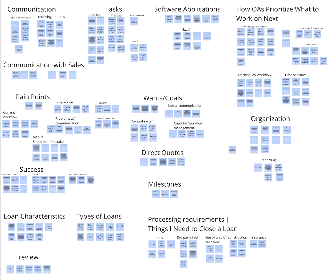
We wanted to understand what an OA’s day actually looked like: how they determined what to work on next, what made one loan a priority over another, where their biggest pain points were, and what systems they had already created to keep themselves organized.
Some of the questions we focused on were:
How do you determine what to work on first or next?
What data informs the priority of a loan?
What pain points do you have with the way you currently manage your work?
How do you know at the end of the day whether you’ve been successful?
If you had a magic wand, what would you change about your workflow?
Key Insights


100%
Some of Operations Analysts’ success was beyond their control.
O.A.s relied on exterior departments to complete all necessary tasks and functions on their end for a loan to progress up the pipeline.
General Loan Overview
O.A.s wished there was a central place to see all info pertaining to a loan in one location


80%
Operations Analysts were good at their jobs.
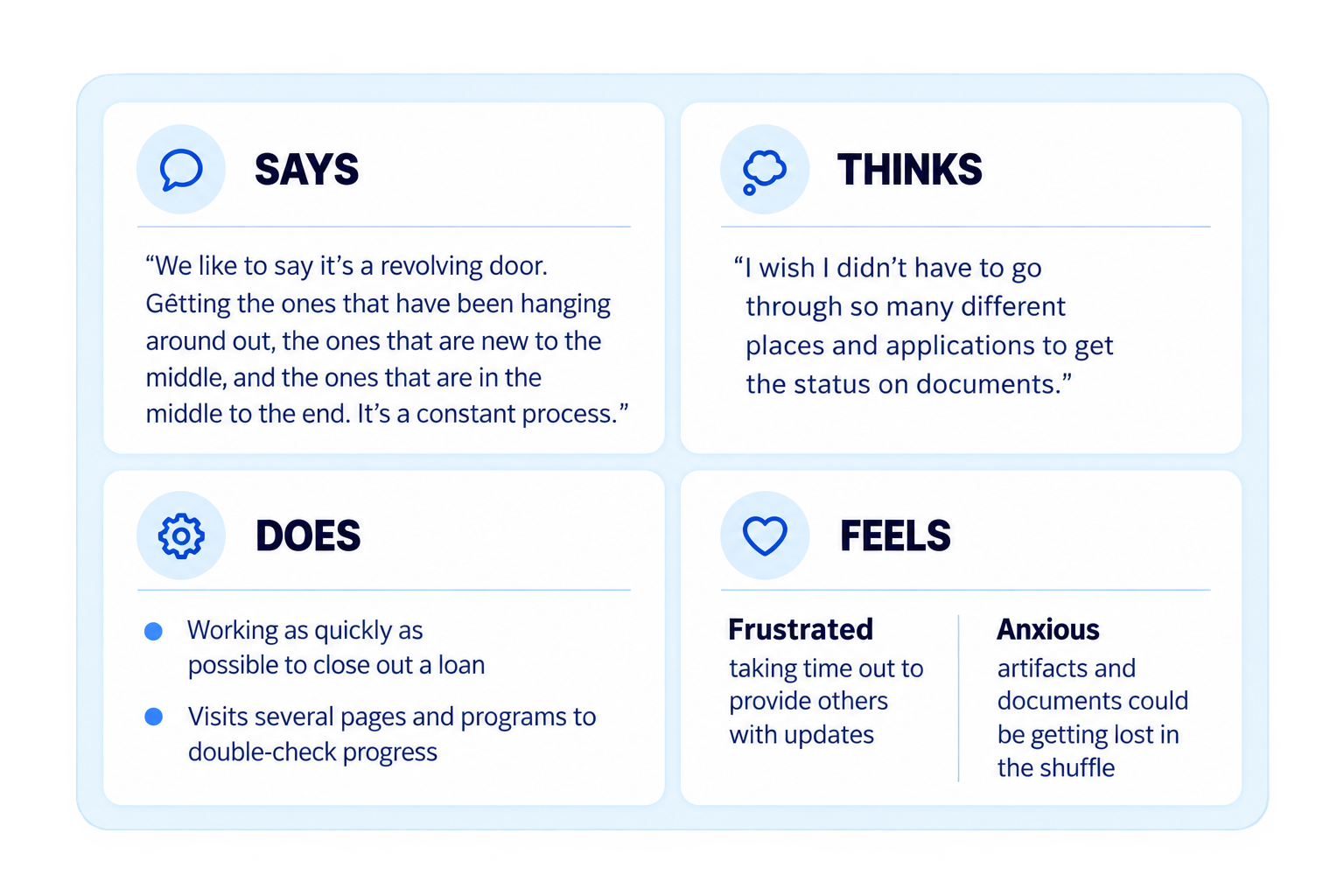
They all had unique ways of structuring their day, organizing their documents, data, tasks, and communications, and each made it work for them.
Loan Filtering
O.A.s wanted a way to filter loans so they could prioritize more efficiently.

80%
Operations Analysts were self-motivated
Even with the sighs, chuckles, and frustration around their current systems, they were jumping in their seats to get back to work and keep their day on track.
Work Week View
O.A.s needed a way to easily see what took priority that specific week.
THE PROBLEM
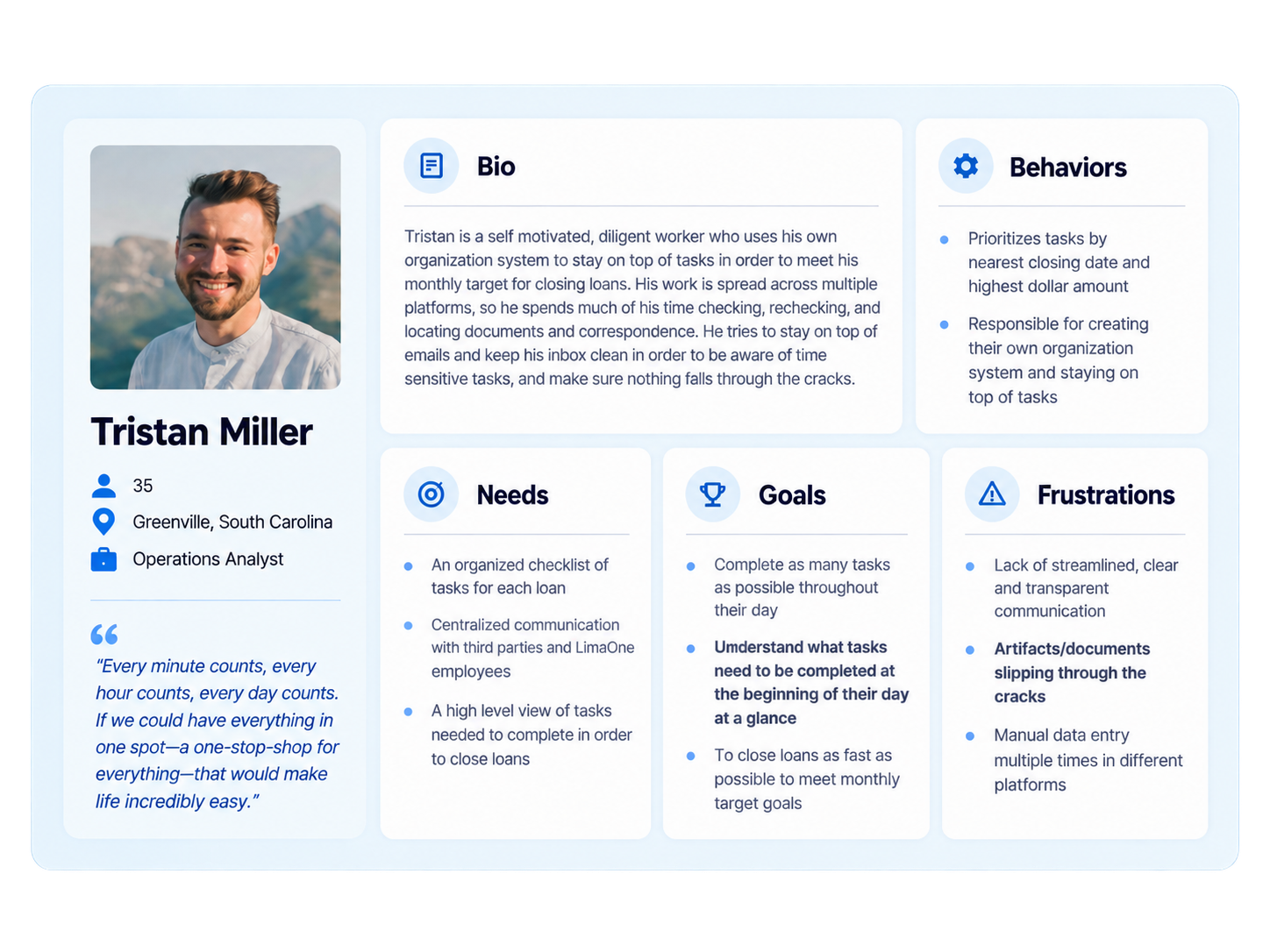
Operations Analysts needed a birds-eye view of all their loan applications in a centralized and transparent model so they could be more strategic in their decisions on what to prioritize.
Ideation
FROM QUESTIONS TO CONCEPTS
Our research led us to a few questions that guided the design →
We moved quickly through sketching and our first Figma prototype — decisions had to be made fast as we had just a week until we presented our designs to stakeholders.
We used this design for our first round of usability tests...
Mid Fidelity Prototype
How might we…
help Operations Analysts visualize tasks across their loans so they can understand what to work on next?
help them feel confident that they’re structuring their workday around the right priorities?
prevent tasks, documents, and communication from falling through the cracks?
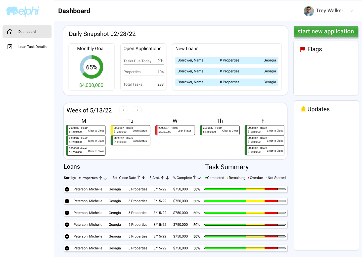
FEATURES/INFO
The first dashboard included a Monthly Goal, Open Applications, New Loans, Calendar, Flags and Updates, and a Loan/Task Summary.
These features reflected behaviors we had seen in research.
For example, analysts already used Outlook’s calendar to keep track of loans closing on certain days. Because this was such an important part of how they organized their week, we wanted to build on that familiar behavior rather than create something entirely new.
The Loan/Task Summary was intended to give analysts a high-level view of their loans while still giving them a path into the work required within each one.
Testing and Iterating
USABILITY TESTING
We tested the mid-fidelity dashboard with OAs and underwriters. Some ideas went well, but others revealed that our design was too informational, and not actionable enough.
Dialing in on the Loan Task Summary
THE BIG AHA MOMENT
In our mid-fidelity prototype we were organizing tasks by each individual property within a loan. That wasn’t helpful.
What we needed was a closing task summary for each loan, not each property. Our users habitually worked on all of their appraisal tasks for a loan at once. The same goes for title tasks, budget, etc.
Since this was the case, it made much more sense for us to help them organize that way.
A MORE USER-CENTERED FORMAT
At one point, a team member and I were debating two different structures for guiding users to loan task details. Her version was linear; similar to Excel. Mine was a card format.
Since we had a tight time constraint, we weren’t able to A/B test on our two representations.
We turned to management at LimaOne to talk the two versions through.
After a short discussion, we went with the card layout.
Once we decided on the format, I designed in real-time as LimaOne management made suggestions for necessary data inputs and improvements that would be more valuable to employees at their company.
That was super helpful. Here’s what we came up with →
Adding action and prioritization
CALENDAR ITERATIONS
I continued iterating on the calendar to help analysts move beyond just seeing which loans were closing that week to see what action they needed to take on each loan, and which ones needed to be prioritized first.
I brought the UI up to high fidelity, titled the calendar more specifically, and made each loan on the schedule clickable so that once users understood its priority they could jump right in to work on the necessary task(s).
Key Findings
Monthly Goal, Calendar, and High Priority Flags: 4/5 task completion rate.
Open Applications, New Loans, and Loan Overview: 3/5 completion rate.
We had given them information. We hadn’t done enough to help them act on it.
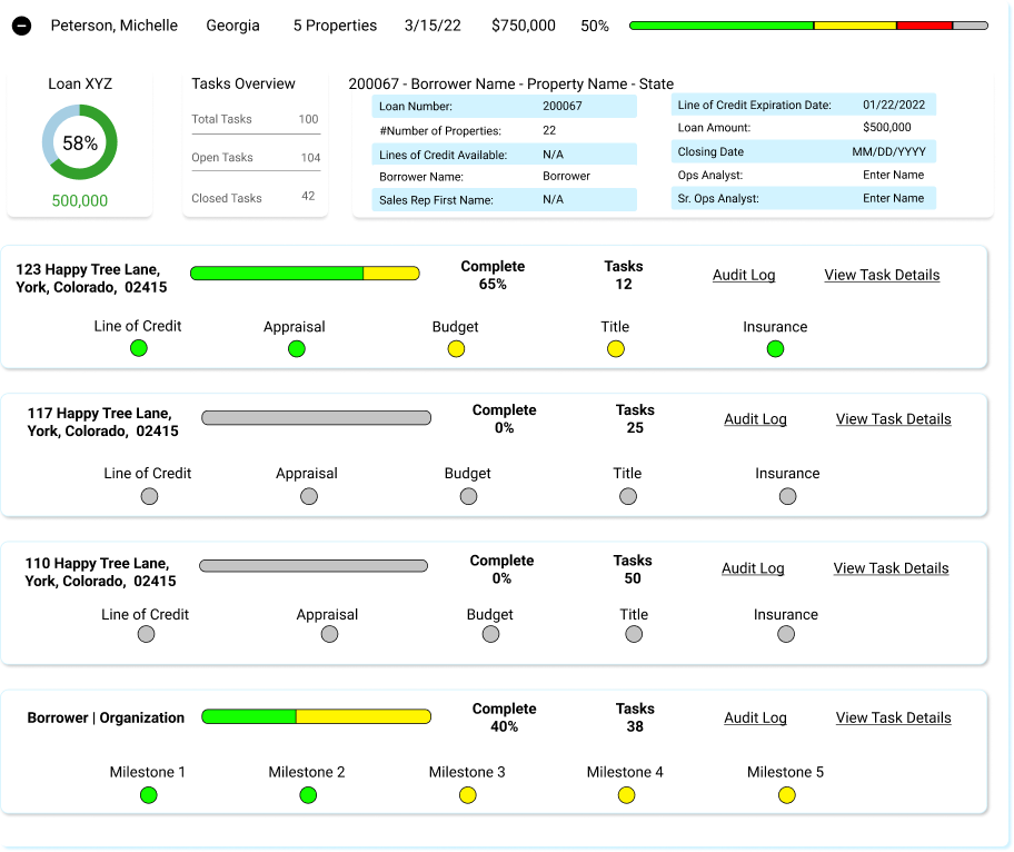
Mid Fidelity Loan Task Summary Version 1 (not helpful)
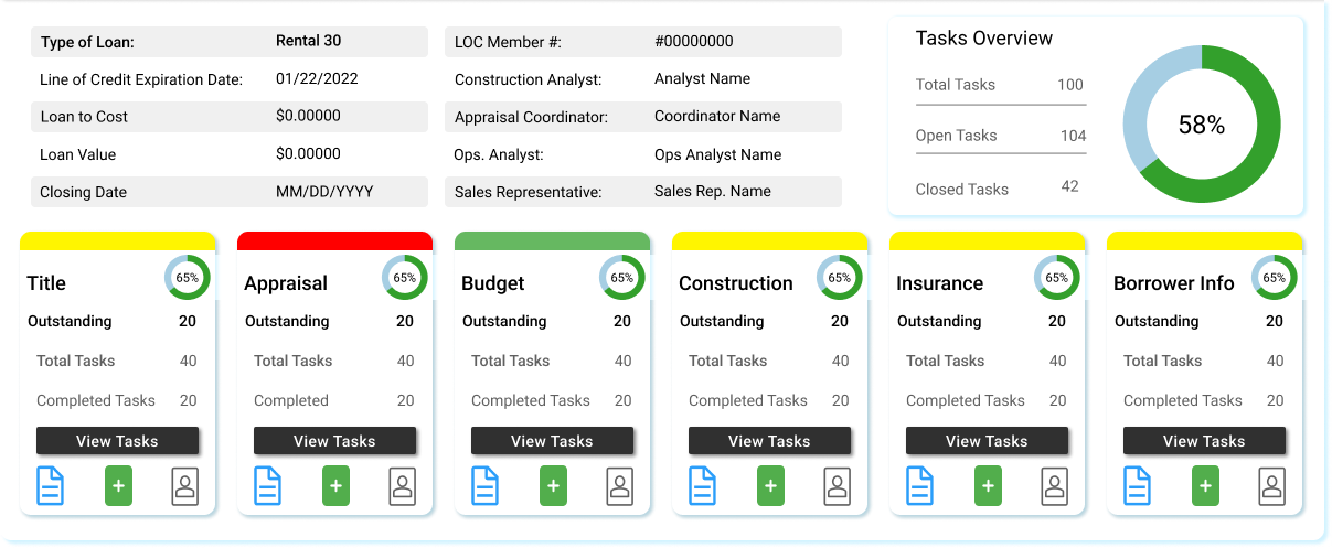
Post Feedback Loan Task Summary
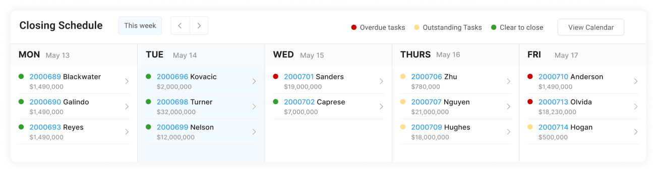
High Fidelity Prototype Version 1
Usability Testing and Final Feedback
For our final round of testing, we focused on whether users could find and act on the information that mattered most.
WEEKLY CALENDAR VIEW
Average completion time improved from 9 seconds to 7 seconds, with a 100% task completion rate.
REMAINING/OVERDUE TASKS
Average completion time dropped from 5.5 seconds to 4.5 seconds, and successful completion improved from 60% to 100%.
OTHER FEEDBACK
There needed to be more focus up front on tasks that were Outstanding and Due.
There was still some uncertainty about the significance of the color callouts on the loan task summary.
Final High Fidelity for Handoff
View the full prototype here
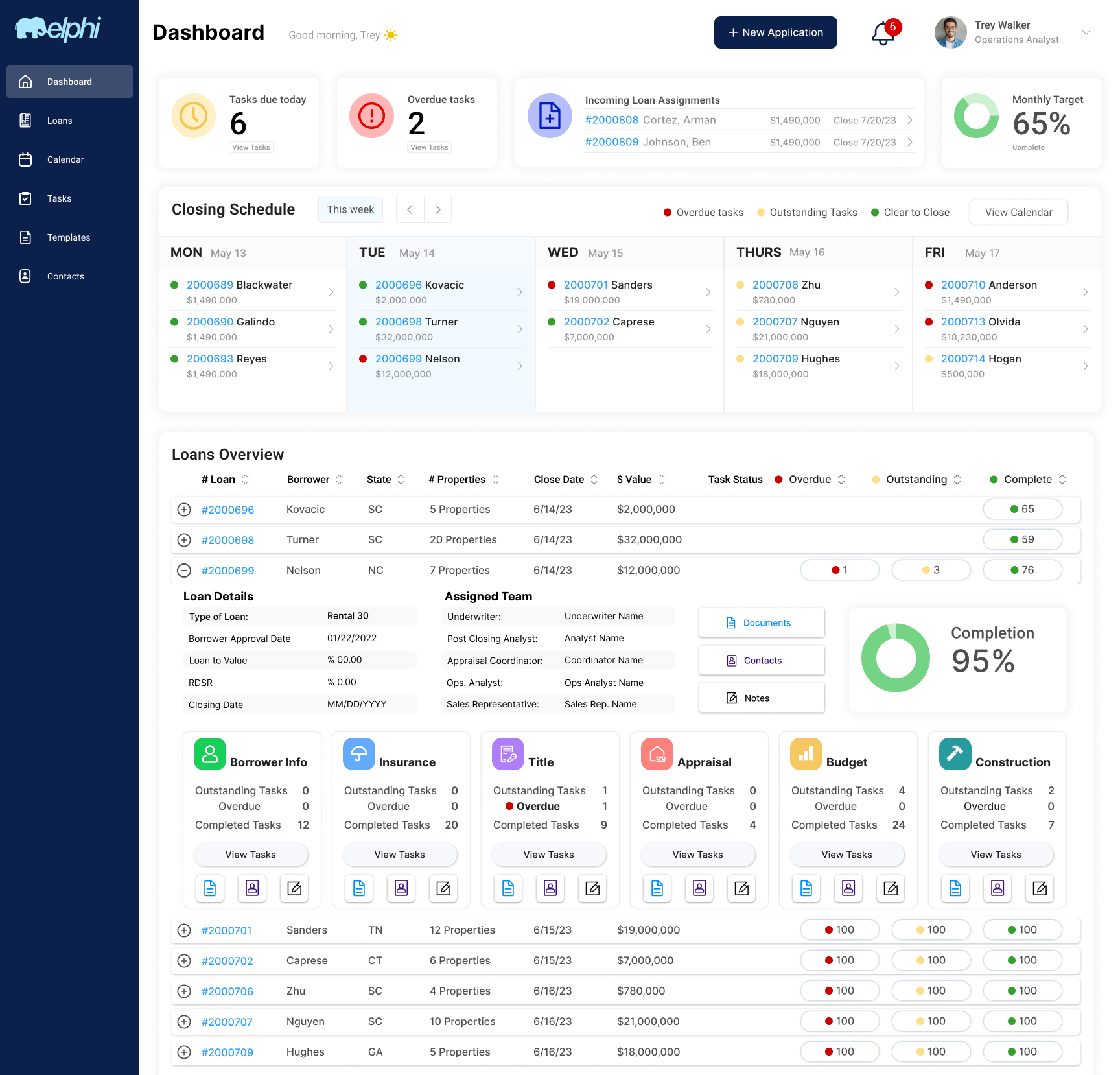
Key features
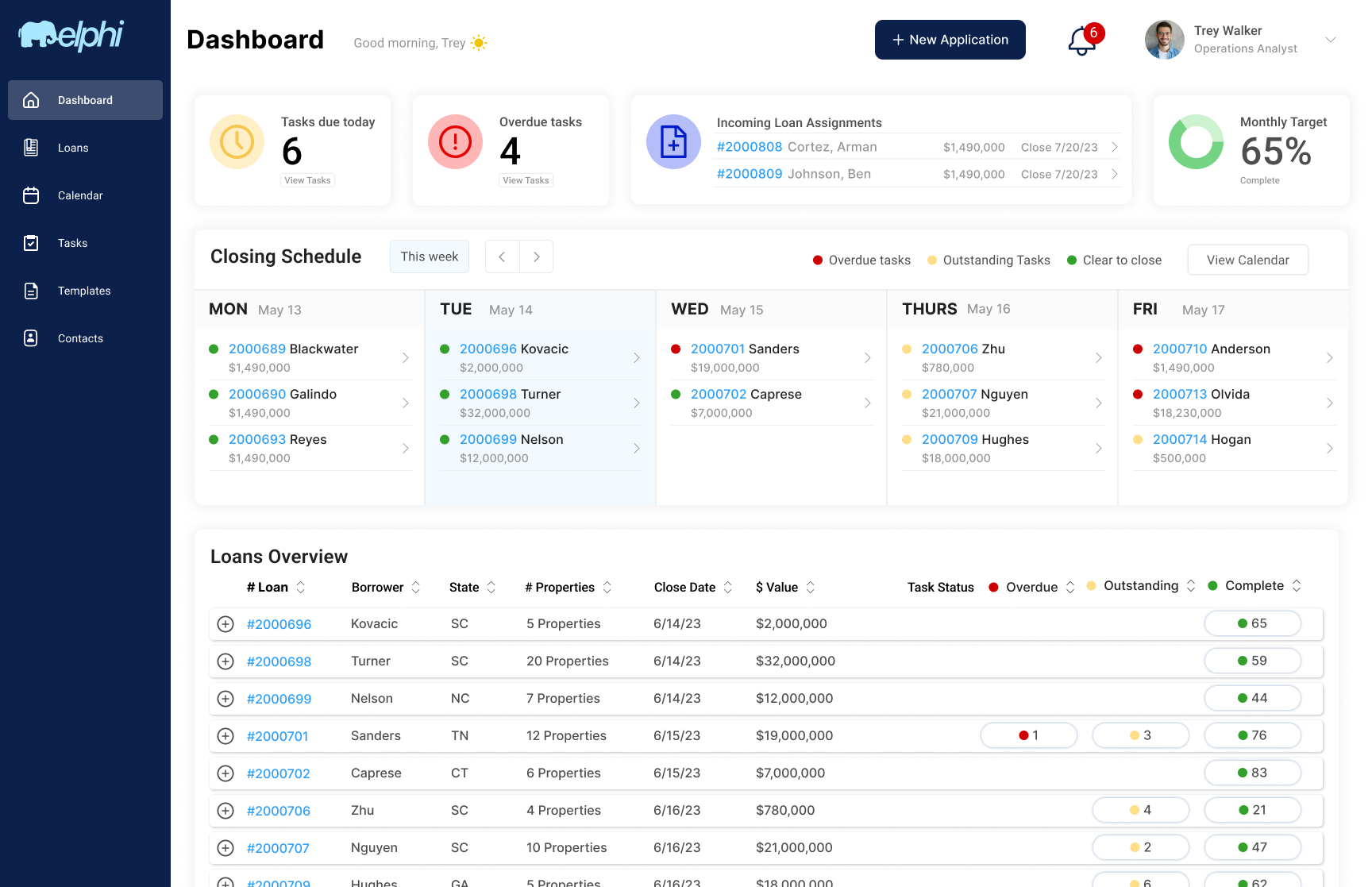
TASKS REMAINING & DUE
Added a call to action at the very first place eyes would land when they logged in to the system.
INCOMING LOAN ASSIGNMENTS
New loans O.A.s had been assigned
MONTHLY TARGET
Every O.A. we interviewed mentioned their monthly target and the importance of hitting it.
CLOSING SCHEDULE
Actionable as well as informative.
LOANS OVERVIEW
All the info O.A.s need to decide what required their attention, with customizable filters for them to prioritize their work in whatever way best suited their needs.
LOAN DETAILS
A snapshot of each loan with an overview of the progress made on it, as well as what still needs to be done, with special callouts for overdue tasks.
The view tasks button would link directly to the Loan Task Details page that was designed by another team.
LOANS OVERVIEW
All the info O.A.s need to decide what required their attention, with customizable filters for them to prioritize their work in whatever way best suited their needs.
LOAN DETAILS
All the info O.A.s need, with customizable filters for them to prioritize their work in whatever way best suited their needs.