

Solving high-impact product problems for
an early-stage social app
product strategy
ux research
ux/ui design
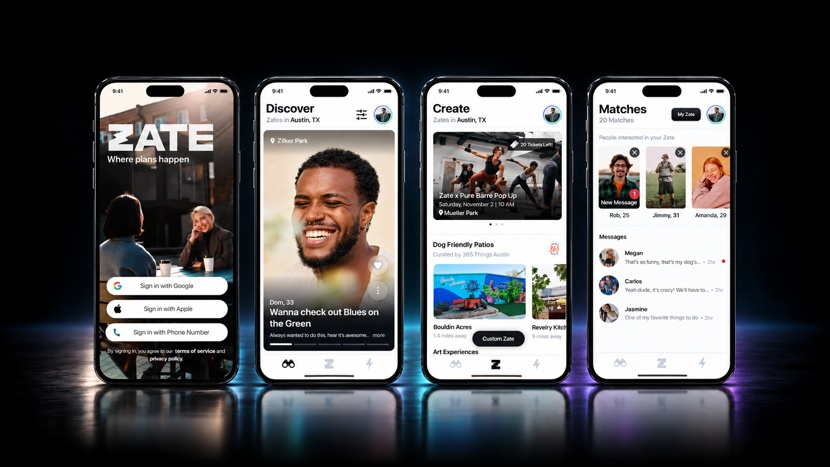
BACKGROUNDZate began as an Austin, TX-based dating app where you post what you want to do—a Zate—and see who wants to join you. The idea formed in 2020, at the height of the pandemic, when people were hungry for connection—to get out and enjoy fun activities with people
When I stepped into a leadership role as designer and product strategist, the app had been live for 18 months and had thousands of downloads, but had issues with user retention.
I led a redesign to improve both the visual and user experience across the app, while responding to user feedback to broaden Zate’s scope to help people find friends, discover events, and purchase tickets.
Every iteration and new feature went through internal testing before we tested at events we promoted and organized.
The feedback loop was strong, but we had to carefully prioritize the changes that would have the biggest impact.
teamFounder
Developer
Designer, Product Strategist (Me)
redesign timeline12 months
toolsFigma
Test Flight
the big problemPeople were excited about the idea of Zate, but that excitement didn’t translate into engagement with the product.
There was friction throughout the journey from understanding Zate → participating → connecting → actually making a plan and following through on it.
the solutionsAn experience and visual overhaul that reduced friction, clarified key flows, and made the app feel as exciting as the idea behind it.
Additional features that broadened Zate beyond dating and supported a wider range of user goals.
the approachI identified a series of smaller problems contributing to the larger issue and prioritized improvements around the user journey, focusing first on the moments with the greatest impact.
01 Understand
Improve onboarding

02 Refine
Improve UX/UI, and
the product system

03 Expand
Add the opportunity
to find friends
04 Commit
Make Zates more
actionable through ticketing
05 Connect
Encourage interaction through “Message First”
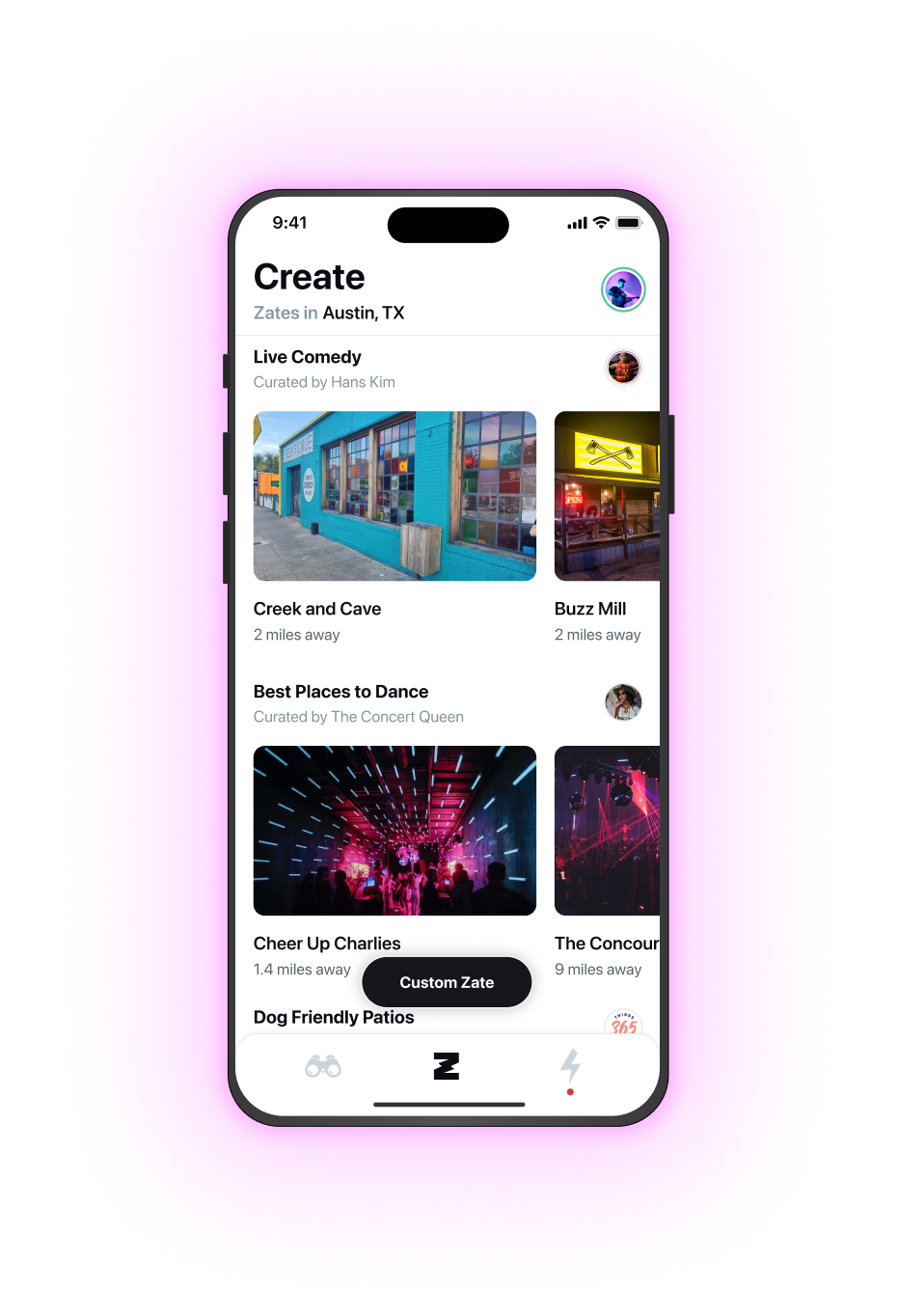
WHAT WAS ALREADY WORKING
Zate was already accomplishing several of its core goals through the Create page: helping users discover places and activities while supporting local businesses and creators.
Curated Zate ideas
Local influencers and people in the know curated categories of places and activities that users could turn into Zates.
This became one of the strongest parts of the product: 80% of Zates created came from curated ideas rather than custom Zates.
Curator posts drove downloads
Working with influencers served two purposes: it gave users a steady supply of unique Zate ideas and created a built-in marketing channel. When curators shared their categories with their own audiences, those posts also drove downloads.
01 Understand
the problemUsers completed onboarding — but weren’t always creating Zates.
For users’ profiles to be visible they needed to create a Zate.
So, although they successfully entered the app, they really hadn’t entered the experience.
the solutionI redesigned onboarding to simplify the process and guide users to create their first Zate.
This transformed onboarding from jumbled account setup into product education.
02 Refine

the problemThe product didn't feel as exciting as the idea.
Users were excited by the concept, but inconsistent patterns, unnecessary friction, and a UI that often competed with the content made the experience feel less intuitive and engaging than it could be.
The opportunity was to make Zate feel as simple, social, and
experience-driven as the concept behind it.
the solutionImprove the UX/UI, and make people and activities the focal point.
I simplified flows across the experience, removed unnecessary steps, strengthened information hierarchy, and created more consistent interaction patterns.
By removing unnecessary background colors, shifting buttons to a more neutral grayscale palette, and adding more photos throughout the app, the interface became quieter and gave the content more room to lead.
The excitement factor from the very beginning
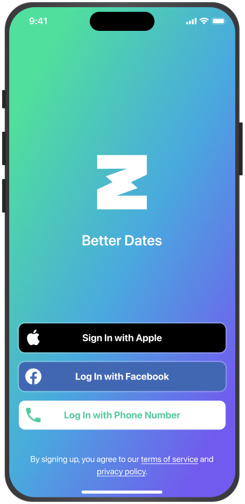
I focused sign-in improvements mostly on the first impression. I replaced the static gradient background with a video of people enjoying fun activities together, giving people a sense of what Zate was about before they even entered the app.
Before
After
Improving the crux of the experience
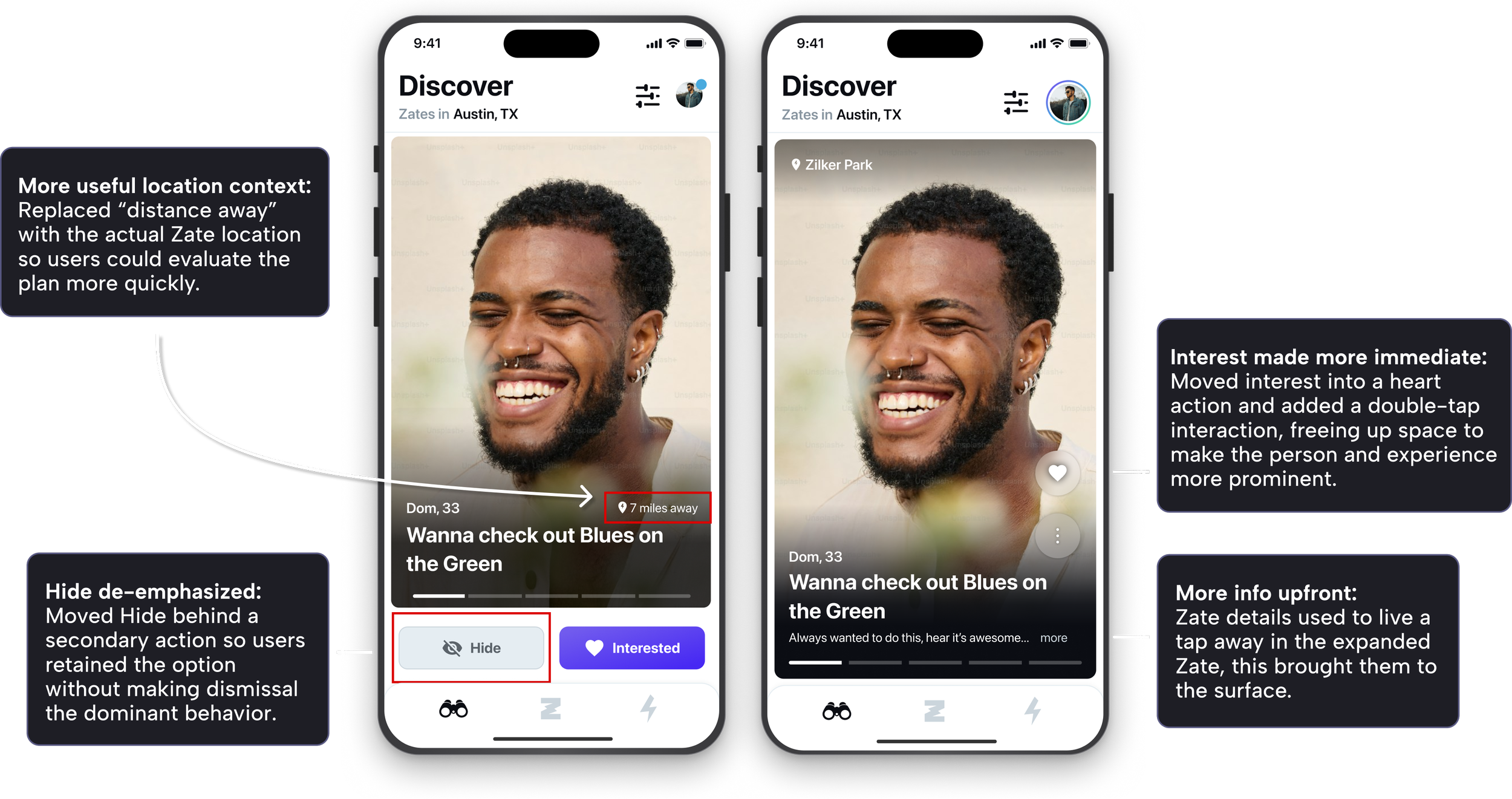
The Discover redesign was one of the areas I was most excited to tackle because I believed it could have the greatest impact on the user experience and how Zate felt to use. I also designed ahead for upcoming features—including friendship, ticketing, and messaging—so the experience could evolve without becoming too complex.
Making experiences the focus
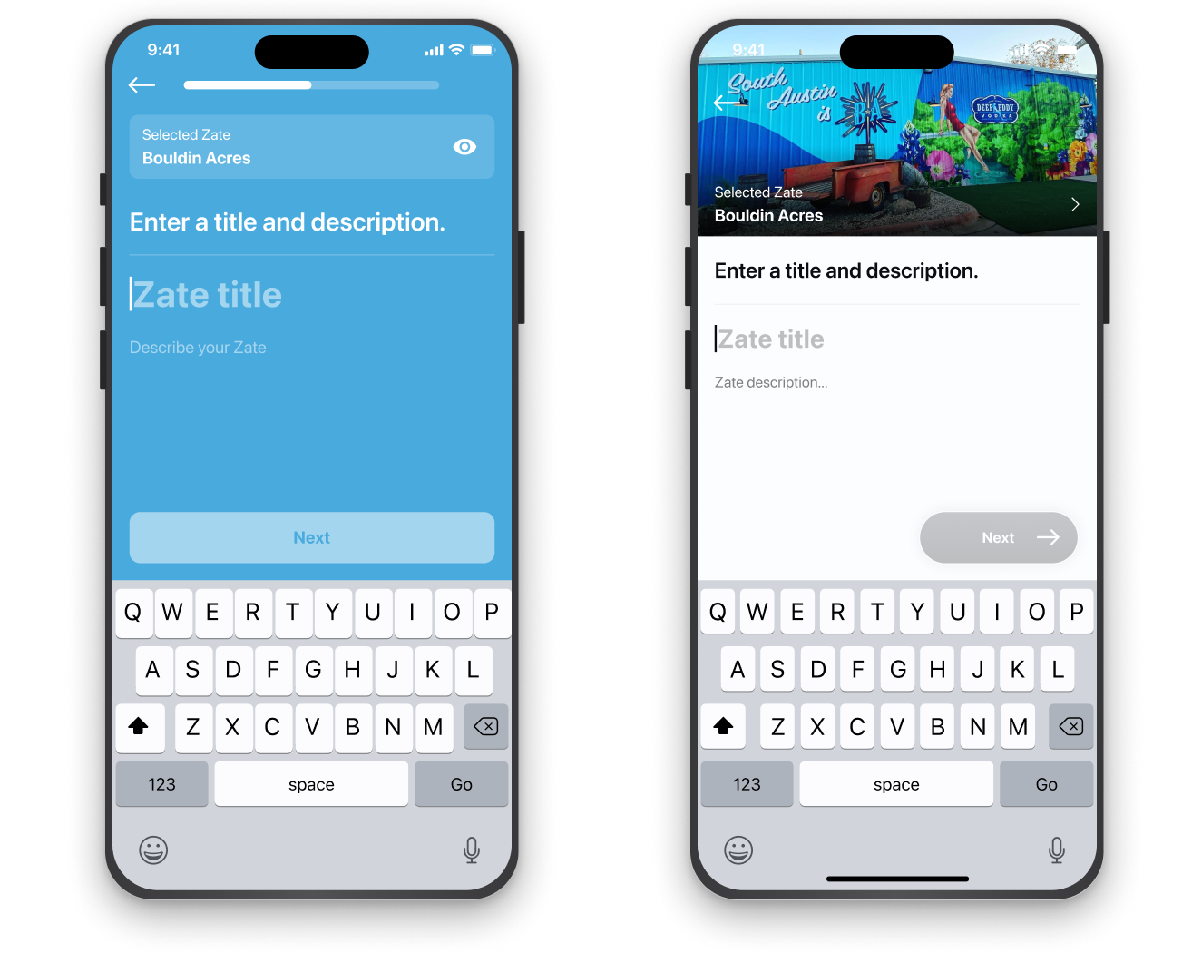
The Create a Zate flow offered one of the clearest opportunities to reduce visual noise and let photography lead. For curated Zates like this one, imagery of the specific place became the focal point throughout the flow, helping users stay connected to the experience they were creating.
Before
After
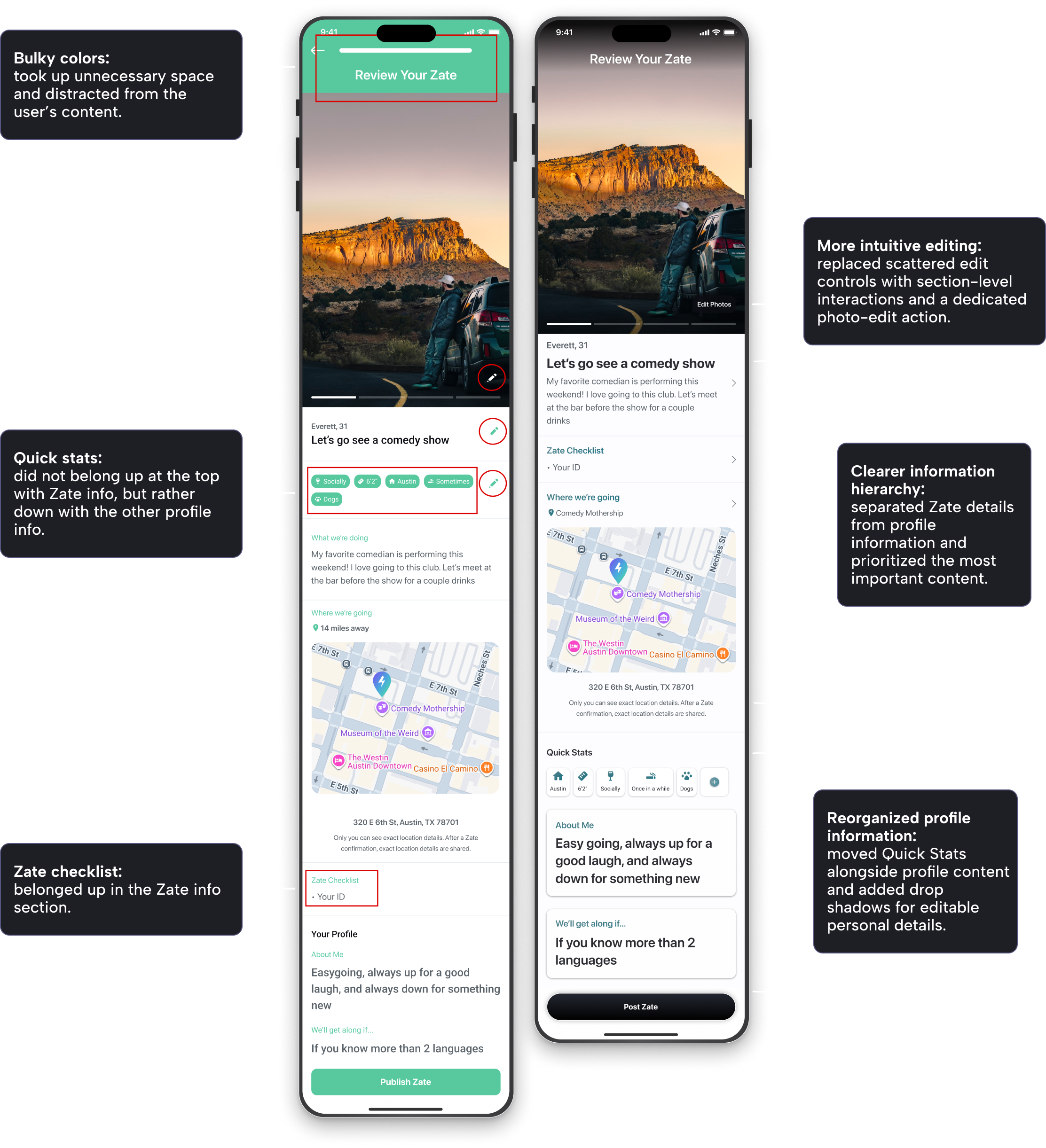
Hierarchy audit and redesign
The Review Your Zate page needed a little bit of everything — toned down colors, the person and experience as the focal point, more intuitive buttons, and component changes carried over — but it especially needed improved information hierarchy. I also added auto layout to make future changes and mockups easier to manage.
03 Expand
the problemUsers wanted to use Zate to meet friends, but the current structure only supported dating.
Research and feedback showed that limiting the product to dating excluded a large portion of prospective users.
the solutionWe introduced the “As Friends” feature.
Since the product was already built around experiences rather than profiles alone, it made sense to expand its scope to offer opportunities for connections beyond just dating.
Our Internal Debate
We debated the best way to make friendship available within Discover.
I advocated for a toggle between friends and dates so users could clearly switch between what they were looking for from moment to moment.
This approach could have shortened onboarding, removed the need to navigate through Settings → Preferences to change intent, and simplified some of the logic our developer needed to support. I also believed it would reduce cognitive load by making the user’s current mode explicit.
The counterargument was that separate Discover feeds could reduce the amount of content visible in each.
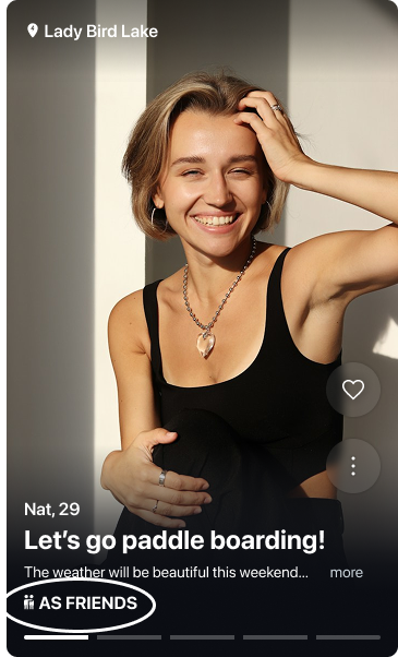
We didn’t have time to A/B test the two approaches. Although I disagreed, we ultimately went with a single Discover feed, using icons on each Zate card to indicate whether the intent was platonic or romantic.
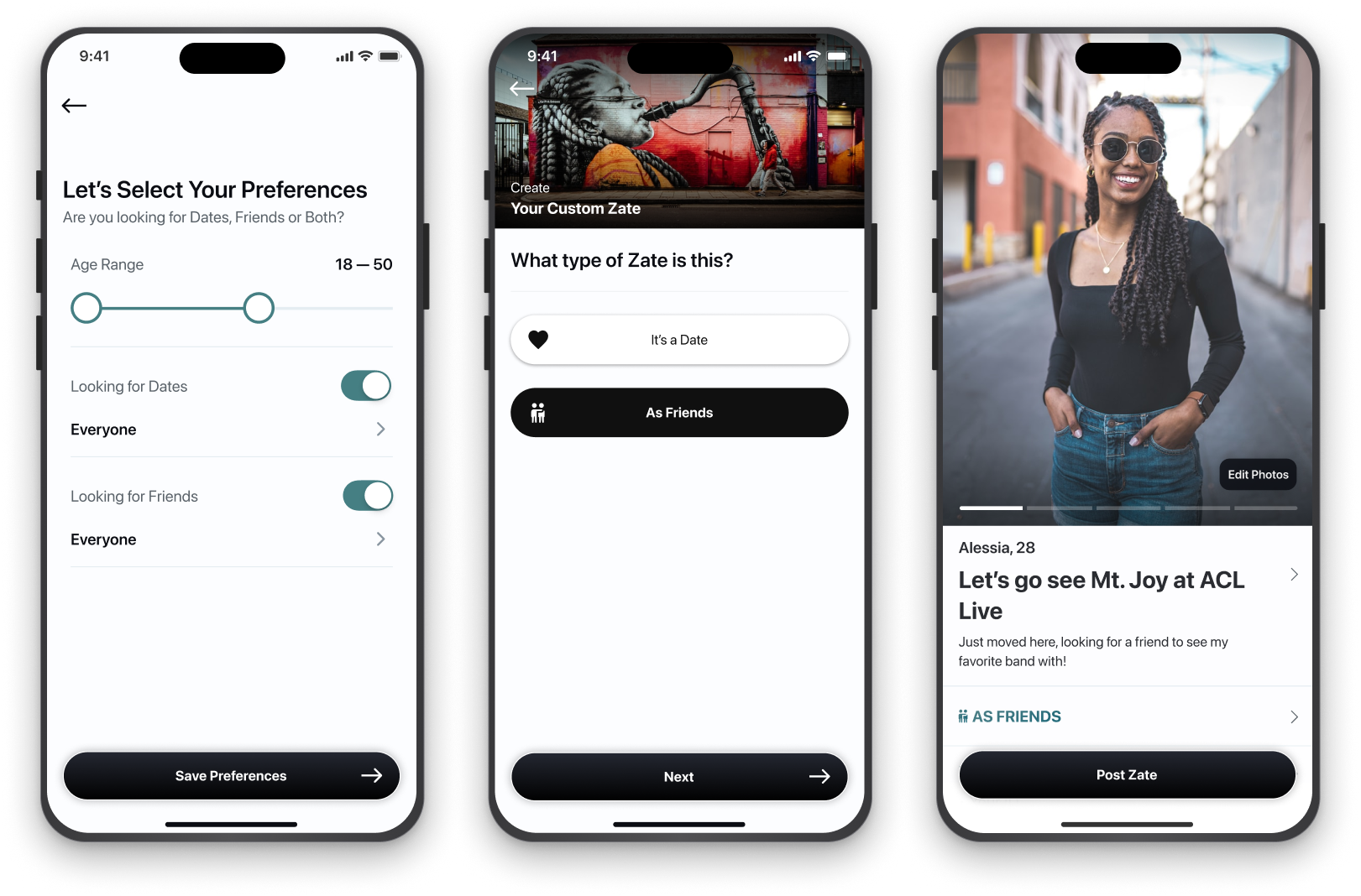
Setting preferences / Posting a Zate
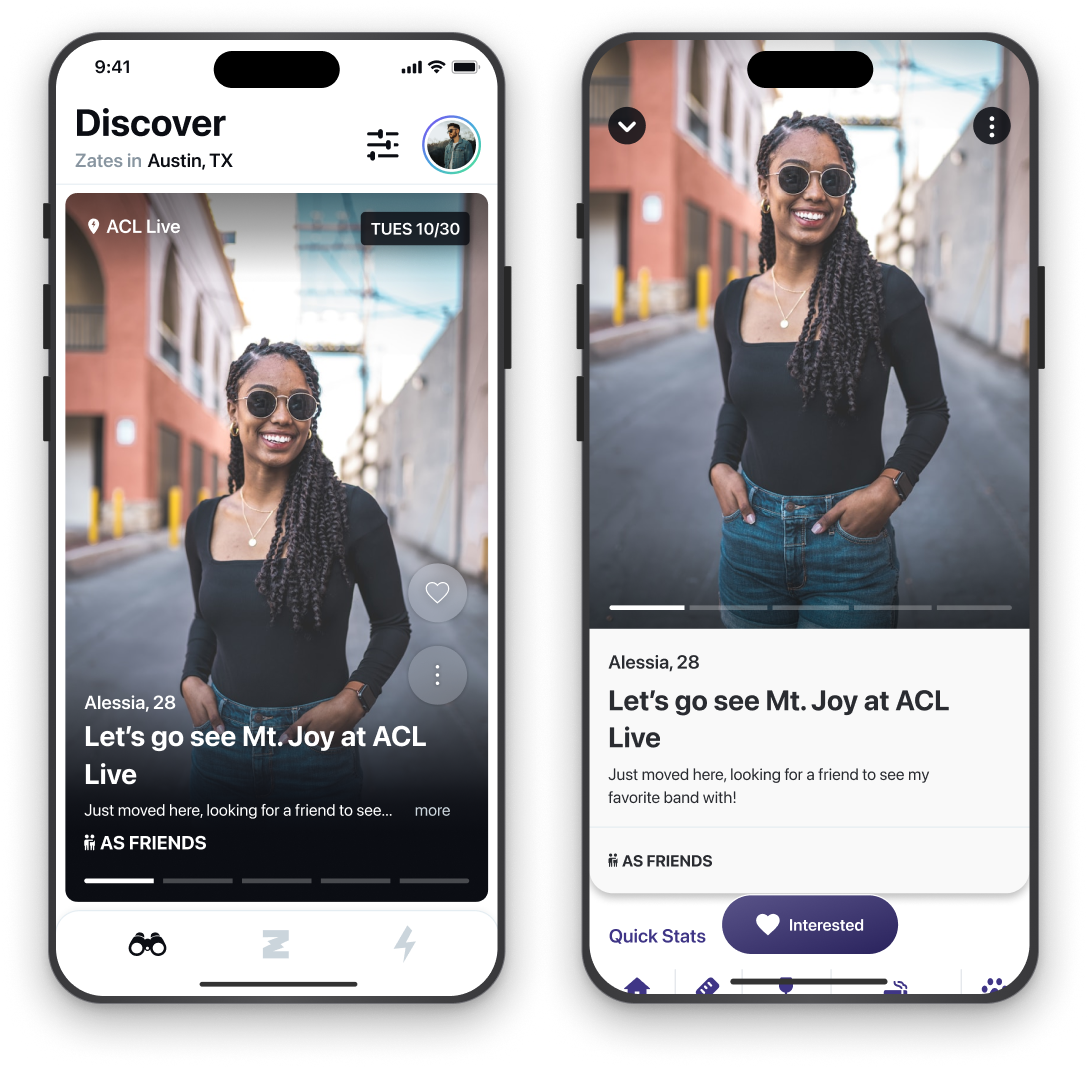
Here are the key screens that changed with the “As Friends” addition.
Viewing “As Friends” in Discover
The icon signifying intent for friendship was visible in both the Discover feed and the expanded Zate view.
04 Commit
the problemConnections weren’t always turning into plans.
Zate made it easy to say, “I’d like to do this.”
But even when a connection led to a conversation, the interaction often stalled before becoming a real-world plan.
That undermined one of the product’s core goals:
getting people out into the world, connecting over places and activities.
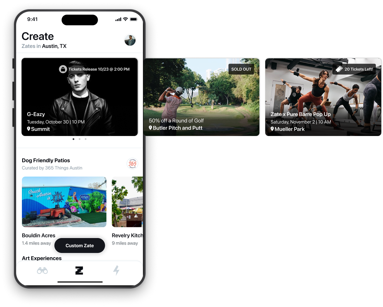
the solutionWe introduced event discovery and ticket purchasing within the Zate experience.
The hypothesis was that increasing commitment around the activity itself could help transform:
“We should do this.” → “We’re doing this.”
It was also central to our monetization strategy.
Key Monetization Strategy
Ticketing wasn’t just intended to make plans more actionable—it was also central to Zate’s monetization strategy.
The broader product vision was to connect users with real-world experiences and capture value when that interest turned into a transaction. Activations helped us test demand and drive acquisition, while in-app ticket sales and the planned Ticketmaster integration created a path toward revenue without relying solely on advertising or subscriptions.
That made ticketing important on two levels: it reduced friction for users while creating a business model around the behavior we were trying to encourage.
Ticketing Implementation Strategy
We planned to introduce ticketing in phases:
01 Activations
We began with limited in-app ticket giveaways for VIP concerts and experiences around Austin. We partnered with influencers to promote them, using the campaigns as marketing opportunities, a way to bring new users into the product, and a way to gather feedback.
02 In-App Ticket Sales
We intended to sell tickets directly in-app through partnerships with local venues. We ultimately skipped this step in favor of Book It to reduce the operational and financial risk of managing ticket inventory ourselves. Although we did ship my designs that supported ticket sales.
03 Book It
An integration with Ticketmaster that offered users a wider selection of events.
*I contributed to the early design and product thinking for Book It, but stepped away from Zate during its design phase. Another designer carried the feature through final design and implementation.
Activations
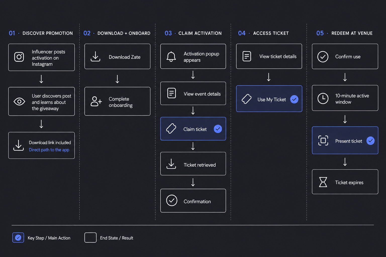
This flow represents a user journey from discovering a ticket giveaway on Instagram to using their ticket at an event.
Prototype of a Live Activation
This particular activation drove 112 downloads. I was at the venue watching people use the app, which allowed me to gather feedback in real time. Combined with onboarding changes that encouraged users to create Zates, activations like this helped drive a 400% increase in Zate creation.
05 Connect
the problemConversation was too restricted.
Only the Zate creator could initiate the first message — and often, that didn’t happen.
Interested users had no way to express themselves beyond tapping Interested and hoping the creator reached out.
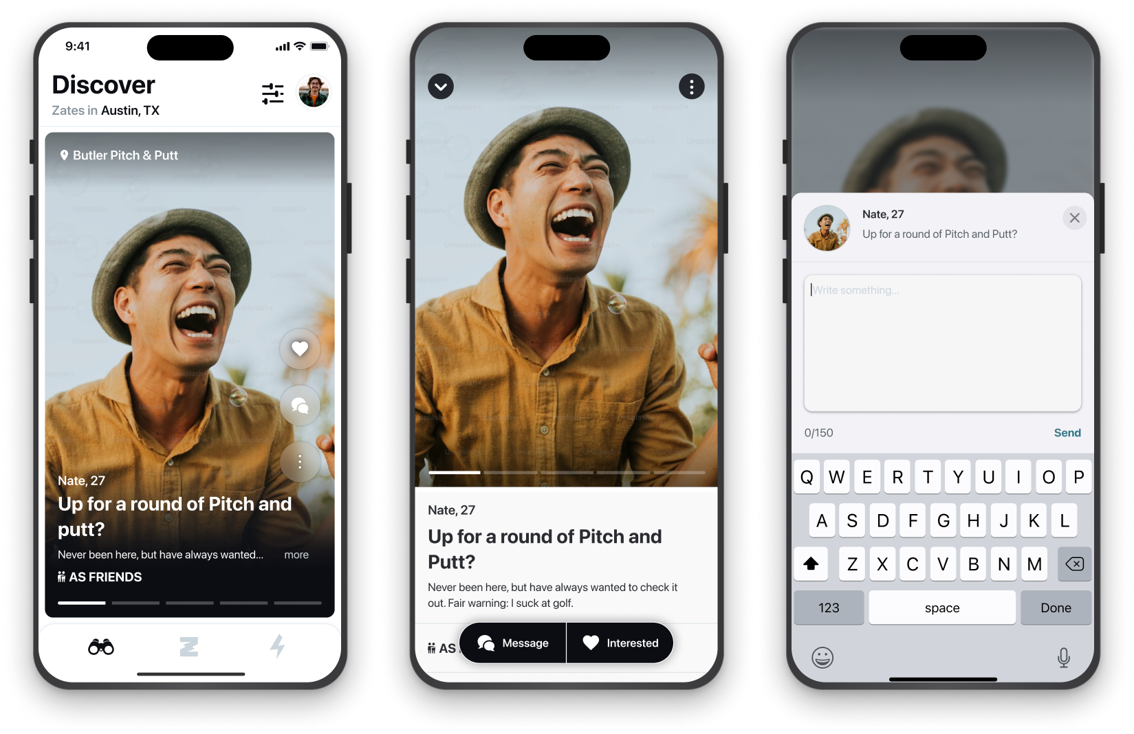
the solutionWe introduced Message First, allowing interested users to start a conversation and show more of their personality to the Zate creator.
The goal: less restriction = more engagement.
Breaking the Ice with the First Message
A user discovers a Zate they’re interested in and can send the creator a message directly from Discover or within Zate Details.
Receiving the Message
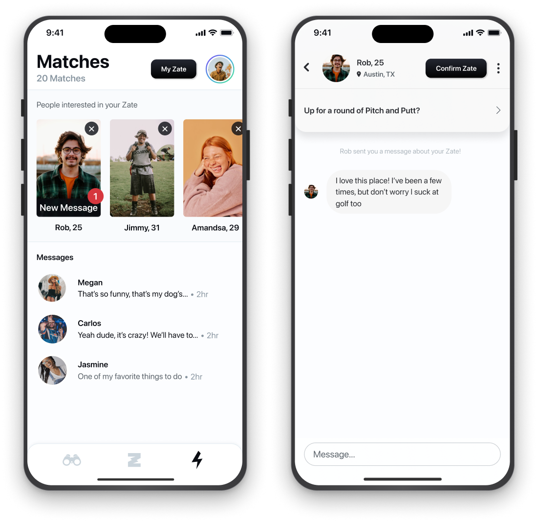
The Zate creator received an incoming message through a dedicated callout within “People interested in your Zate.” From there, they could open the message, view it in the context of the Zate, and choose whether to respond.
Zate Reflections
Zate was the first product I was part of from the very beginning, with a hand in strategy, design, marketing, and product development.
I learned a lot, made mistakes, changed my mind, and became a stronger designer because of it. These lessons stood out above the rest:
A lesson in scalability
Unlike other dating apps, which depend primarily on having enough users in the same area, Zate also depended on having meaningful local content through curated categories.
In a city like Austin, that model worked well, but scaling the same experience to every city—and especially to smaller towns—would have ranged from difficult to impossible. It would have required identifying local curators, vetting them, collecting recommendations, maintaining those relationships, and continuously updating content.
This affected more than content availability—it meant Zate couldn’t simply launch wherever users existed. Each new market also needed enough local content to make a core part of the product function, creating the risk of an inconsistent experience as the product expanded.
The lesson for me was that:
Scalability isn’t only about whether a team can support growth. It’s also about whether the product can deliver its core experience consistently as it expands.
Actions speak louder than words
In our early research, people repeatedly told us they enjoyed meeting others through shared interests and activities, or wanted to find people to share experiences with.
When the app launched, the concept generated enthusiasm. But over time, I learned that enthusiasm for an idea doesn’t necessarily translate into sustained behavior.
As we watched people use the product, it became increasingly clear that many users were hesitant to put themselves out there and commit to an activity with someone they didn’t know yet.
What sounded exciting in theory could feel vulnerable in practice.
The behavior users seemed more comfortable with was almost the reverse of our original premise: build some level of connection first, then make plans once there was comfort, trust, or mutual attraction.
A compelling concept can address a problem people genuinely recognize and still ask them to behave in a way they aren’t naturally inclined to.